Forgiveness in UI design
Users make mistakes, no matter how good your user interface is designed. But there is something you can do about it. There are approaches you can use to allow users to recover from errors, or even better to prevent errors. One such approach is called forgiveness. Let’s explain it in more detail and see some inspiring examples.
Feedback and error recovery
One of the most important aspects of forgiveness is good feedback. Users should be informed about (potential) errors and how they can affect their work. Good feedback doesn’t consist only of well explained error messages. It also contains actions which users can perform in order to recover from the error.
However, users won’t be able to undo every mistake. Some mistakes are simply irreversible. Those are situations where users get really frustrated so, it is important to suggest solutions to help remedy problems.
Error prevention
Feedback is necessary not only after an error happens; it has an important role in error prevention. Users should be warned of possible consequences of their actions. A good example is when users want to navigate away from the web form that was edited but not saved. A confirmation dialog can prevent loss of data.
Error prevention can also be done by creating less constraints on the user interface. For example, an input field can accept various formats and let the system take care of it.
A few good examples – do it the Google way (not wave)
You don’t have to search much to find good examples, you are using them every day. Google really takes full advantage of forgiveness. Let’s see how they do it.
Undo
Undo feature is one of the most common and most useful means of forgiveness. If you delete email messages from Gmail inbox you will be able to undo your action immediately. Also, deleted messages can be recovered from trash 30 days after deletion.

Did you mean…?
If you search for a term and misspell it, there will be a suggestion to try a different search by clicking on a link which contains corrected terms, placed next to “Did you mean” label. Also, top two results from this corrected query will be shown above the original results. It is easy to recover from this mistake.

Auto save
When dealing with large amount of data such as text documents, one of the most efficient ways to prevent errors and loss of data is auto save feature. Users’ work is frequently saved thus minimizing potential damage of data loss. Even if something happens with unsaved work, you will be able to restore the last save. This is usually implemented in word processors but it can be used almost anywhere.

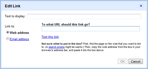
Are you sure…?
An example from Google Docs. If you type something and try to close an open tab or window, you will be prompted with a confirmation dialog.

Forgiving format
User interface can be forgiving in less obtrusive ways than confirmation dialogs and warnings. It can accept various kinds of input from users and let the system handle them. This UI pattern is called forgiving format. In Google Maps search field you can search by any combination of these terms: country, city, address, zip and other places.
![]()
Enable/disable actions when needed
Another good way to prevent users making errors is to enable actions only when it is possible to perform them. If you want to add a link in the body of an e-mail message in Google mail, you’ll be able to do so only if you actually type it in an input field. This simple trick can sometimes prevent serious damage.
Conclusion
There are many ways in which user interface can be forgiving. Good feedback with suggested actions for error recovery or even error prevention will highly affect the overall user experience. However, you should be careful because it is easy to overdo the usage of different measures. For example, if an action can be undone, there is no need to overwhelm users with confirmation dialogs and warnings.
Do you have some other examples of forgiveness? I am sure there are more excellent ideas besides Google.
* * *
Remember RSS? You can subscribe to my blog here.
20 Comments
ah, very nice in deed. I guess we already implement couple alert pop-up and edit feature. undo is just different aspect.
For examples you could read ‘Defensive Design for the Web: How to Improve Error Messages, Help, Forms, and Other Online Crisis Points’ by 37 Signals http://www.amazon.co.uk/Defensive-Design-Web-Improve-Messages/dp/073571410X/ref=sr_1_1?ie=UTF8&s=books&qid=1258469564&sr=8-1
Really a great article. Awesome. Thank you so much!
Lovely article, any chance of examples that AREN’T from Google?
While I agree with the spirit of your post and that forgiveness in UI design is a priority I can’t help but note that Google is probably one of the worst examples of proper user experience and design. It’s a fairly common mistake for people to assume that because Google is so huge in terms of users they must be doing things right from a user experience point of view.
Often the dialog boxes and messages are too hidden to be of use, and their navigation paradigms are really awful, IMHO.
However, if you’re looking for a great example of user experience that provides forgiveness I’d suggest taking a look at something like http://www.wufoo.com :)
Like I said earlier, the spirit of your post is absolutely correct I just wish people wouldn’t continue to use Google as the poster-child for good user experience :P
Thanks, gave me some ideas for the apps I’m working on.
Thanks everyone for the comments.
Adam: thanks for recommendation, I’ll take a look at it.
Stuart, Dave: Although I completely agree that Google is not the best example for user experience, I think those examples are really good and people can easily recognize them because they use their services every day (this is how I got the idea for this article). I know there are more great examples like the one you mentioned ;)
Interesting stuff for today. Thanks!
Nice post, agree that Google is often presented as the pinnacle of proper UX… sometimes true, sometimes not. Jankos point re: sheer number of users exposed to Google UI is well taken.
This post likely owes a nod to Nielsens Ten Usability Heuristics:
http://www.useit.com/papers/heuristic/heuristic_list.html
Excelente artículo, I liked it. :)
I can’t agree more. UI is very important to users or customers. Even your service is the best, you’ll not be successful without good UI.
PS. I just noticed that Gmail offers the undo operation.
"Feedback is necessary not only after an error happens; it has an important role in error prevention."
I agree. It makes you aware that a certain kind of error can happen. Makes you avoid the same error and gives you a solution.
Nice point. Forgiveness is often neglected aspect while making UIs. Rather than pointing fingers at the user, anticipating is better approach.
About ‘disabling’ certain elements, a more forgiving approach is explained here http://www.joelonsoftware.com/items/2008/07/01.html
I liked the intent of your article, but it was completely drowned out by the fact that it is impossible to read (white on black).
Malte: I am aware of the fact that it’s harder to read white text on dark background (of of the reasons for upcoming redesign), but it is indeed possible :)
Wow, i thought i somehow already red this article and commented until it hit me that my last name isnt "Christensen" :P
As always Janko, really nice article.
Nice to finally add a name to all those things i stumble upon when browsing :)
Agree with you…I seldom see site that allows you to undo what you’ve done. It happens a lot when you submit comments and would like to take back what you’ve said..it will be permanent not unless you contact the webmaster and have him/her delete your comment.
Hey, Nice article. I loved the comparisons with Google. Google is a phenomenal example of great UI. With the regular introduction of new tools and features it leaves no stone unturned to make web browsing more interesting for its users.
great article :)
I’d only mention that validating user input and notifying them of possible errors should be done in both frontend (GUI) and backend (logic). Well it really depends how you assemble the application. But most of todays frontend (GUI) user input validation is done with javascript, which can easily be turned off. That’s why i think it’s necessary to do the validation on both sides of the application.
Forgiving Format – I really enjoy the use of language to indicate the function here. It is so easy to hit the wrong button, and the "are you sure…?" popup has really saved my data on so many occasions that I feel it should be an integral part of your design. If it isn’t, user feedback will soon convince you that it is desirable to have this feature.
I’m really enjoying your blog, Janko. Good work!
Jacques